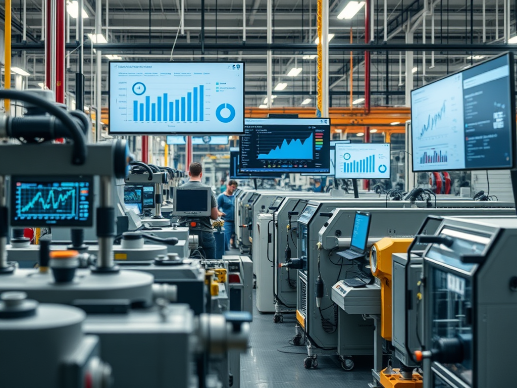
If you’ve been in manufacturing for a while, you know the plant floor is noisy—not just with machines, but with data. Every sensor, robot, and PLC is constantly spitting out numbers. But here’s the thing: all that data is just noise unless you turn it into a story people understand. That’s the real power of storytelling with IIoT data. It’s not just about dashboards and KPIs—it’s about helping real people make better decisions, faster.
Why IIoT Data Needs a Story
I’ve seen plenty of projects where we connected every machine, built a dashboard, and… nothing changed. Why? Because data alone doesn’t drive action. People act on stories—especially when those stories are clear, relevant, and easy to grasp.
For example, at a large process site, we rolled out a platform to collect every tag you could imagine: temperatures, pressures, downtimes, energy use. The first dashboards we built were technical masterpieces—dozens of charts, live trends, and color-coded widgets. But when I sat down with the operations team, their eyes glazed over. They didn’t see a story; they saw a wall of numbers.
So, we changed our approach. Instead of showing everything, we focused on the “why” behind the data. We built a simple dashboard that told the story of a shift: where time was lost, what caused the biggest bottleneck, and what one thing they could fix tomorrow. Suddenly, the data made sense. The night shift started using it in their handovers. Maintenance teams picked up on recurring issues. That’s when we started seeing real improvements—like a boost in OEE and fewer unplanned stops.
What Makes a Good IIoT Data Story?
Over the years, I’ve learned a few things about what makes IIoT data storytelling work on the plant floor:
1. Start with a Real Question
Nobody cares about “data for data’s sake.” Start with a real problem. For example, “Why did line 3 stop twice as often this week?” or “How can we improve batch yield by 2%?” The story should answer a question someone actually has.
2. Show Cause and Effect
The best dashboards don’t just show what happened—they show why. At one site, we used time-series data from a historian system to map out every downtime event, then layered in operator comments and maintenance logs. We could see that a spike in rejects always followed a certain temperature drift. That’s a story: “When this happens, that happens—here’s what to do about it.”
3. Keep It Simple
I’ve seen dashboards with 30 tabs and 100 widgets. They impress IT but confuse everyone else. The most effective stories are simple: a trend, a few KPIs, and a clear call to action. Tools like Grafana can do this well if you resist the urge to overcomplicate.
4. Make It Personal
If you want people to act, make the data about their world. At a packaging plant, we built shift dashboards that showed each team how their performance compared to the last shift. It sparked some friendly competition—and real improvement. People care more when the story is about them.
5. Use Real-Time Data for Real-Time Decisions
There’s a big difference between a monthly report and a live dashboard. When you put real-time data in front of operators—like live OEE, downtime cause, or quality trends—they can react before small problems become big ones. At one plant, we cut average downtime significantly just by giving operators a live view of bottlenecks and letting them log the root cause on the spot.
The Tools That Make It Happen
When I talk about turning IIoT data into stories that drive action, I’m thinking of platforms designed from the ground up for industrial IoT—tools that can connect to machines, sensors, and cloud analytics, and present that data in ways people on the plant floor (and in the boardroom) can actually use.
For example, platforms like PTC ThingWorx have made a big impact in manufacturing by letting teams build custom dashboards that visualize live machine states, downtime reasons, and energy consumption. I’ve seen ThingWorx used to create “shift performance” dashboards that operators actually check during breaks, because they can see—in real time—how their line is running compared to the last shift. This kind of visibility has helped teams spot bottlenecks and take ownership of improvements, sometimes delivering measurable OEE gains in just a few months.
Siemens MindSphere is another IIoT platform that connects assets across multiple sites and brings their data into a unified cloud environment. I’ve seen teams who used MindSphere’s analytics and visualization apps to track everything from batch quality to predictive maintenance. The real power comes from combining process data with contextual information—like operator comments or weather data—to tell a story about why a process drifted or a machine failed. This has supported faster root cause analysis and more confident decision-making.
Azure IoT Operations and AWS IoT SiteWise are also widely used in manufacturing for scalable, cloud-based visualization. I’ve seen Azure IoT Operations dashboards help monitor multiple plants remotely, with alerts and drill-downs that let them quickly spot trends and anomalies. AWS IoT SiteWise, paired with visualization tools like Grafana or custom web apps, enables teams to build real-time dashboards that combine sensor data, machine learning outputs, and operator feedback—all in one place.
GE Predix is another platform, especially in asset-intensive industries. Its industrial analytics and dashboarding tools help teams track asset health, predict failures, and share those insights in a way that’s easy for both engineers and managers to act on.
The common thread with all these IIoT platforms is their ability to break down silos—connecting OT data, contextual business info, and human input into a single, interactive story. That’s what turns raw IIoT data into decisions that matter.
If you want to make your IIoT data stories stick, pick a platform that fits your use case, build dashboards around real questions, and always involve the people who will use them. That’s where the real value is unlocked.
The Human Side: IT/OT Convergence and Culture
Here’s a truth: the hardest part of IIoT data storytelling isn’t the technology. It’s getting IT and OT (operations) to work together. IT cares about data quality, security, and systems integration. OT cares about uptime, safety, and making sure the line keeps moving. If you don’t bridge that gap, your data story will fall flat.
At a global manufacturing network, we spent months just getting everyone to agree on what “downtime” meant. Once we did, we could build dashboards everyone trusted. That trust is what turned dashboards into action.
Most IIoT projects fail because people try to solve culture with technology. You need both. The best results come when you bring IT and OT together early, define what success looks like, and build tools that fit the way people actually work—not the way the spec sheet says they should.
Lessons Learned (Sometimes the Hard Way)
- Don’t chase perfect data. Real plants are messy. If you wait for perfect data, you’ll never launch. Start with what you have, and improve over time.
- Operators are your best storytellers. The best insights come from combining machine data with human context—operator notes, shift logs, maintenance records.
- Iterate fast. Build a basic dashboard, get feedback, and improve. Don’t spend months designing the “perfect” solution in a vacuum.
- Celebrate small wins. Even a 2% improvement in OEE or a 10-minute reduction in changeover time is a big deal on the plant floor. Tell those stories.
Wrapping Up
If there’s one thing I’ve learned, it’s that the real power of IIoT data isn’t in the numbers—it’s in the stories you tell with them. When you turn data into a story people understand, you turn insight into action. And that’s how you make a plant smarter, simpler, and more connected.
Leave a Comment